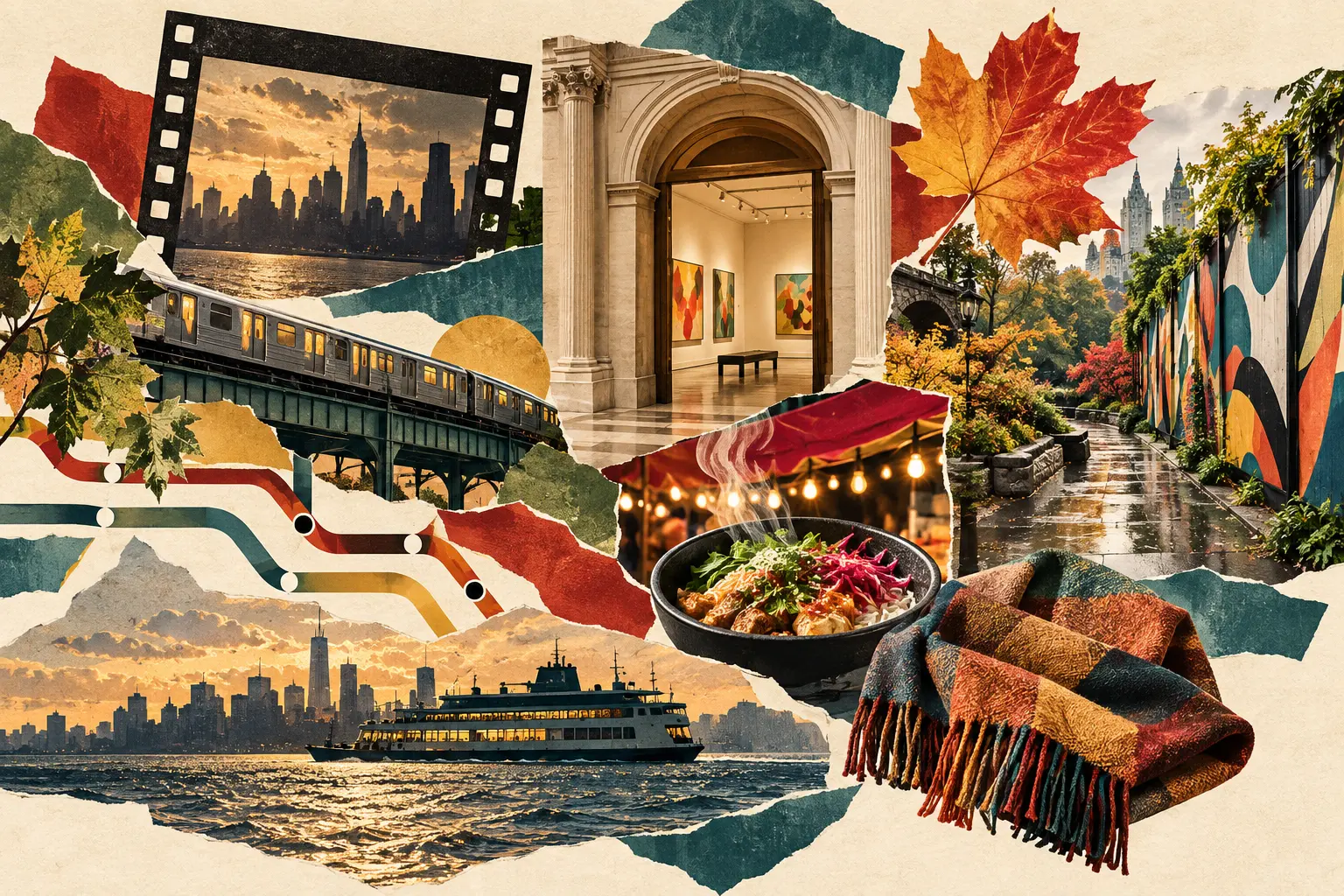
We put twelve Fall 2026 colors on the table and immediately removed black from the meeting. Black remains employed. It simply did not need to chair this particular committee.
What remained was more useful: oatmeal, plum, moss, butter yellow, deep brown, turquoise, charcoal, peach, burgundy, electric blue, scarlet and powder blue. Runway and street-style reporting this year has made a persuasive case for saturated color, tactile brown, softer tailoring and combinations that move beyond automatic black and gray. The Borough Signal part is deciding which colors should actually share a coat rack.
These are five original fall color formulas for New York. They are not complete outfits and they are not instructions to buy five wardrobes. Think of each as a ratio you can test with clothes already present, then adjust for weather, work and willingness to be noticed before coffee.
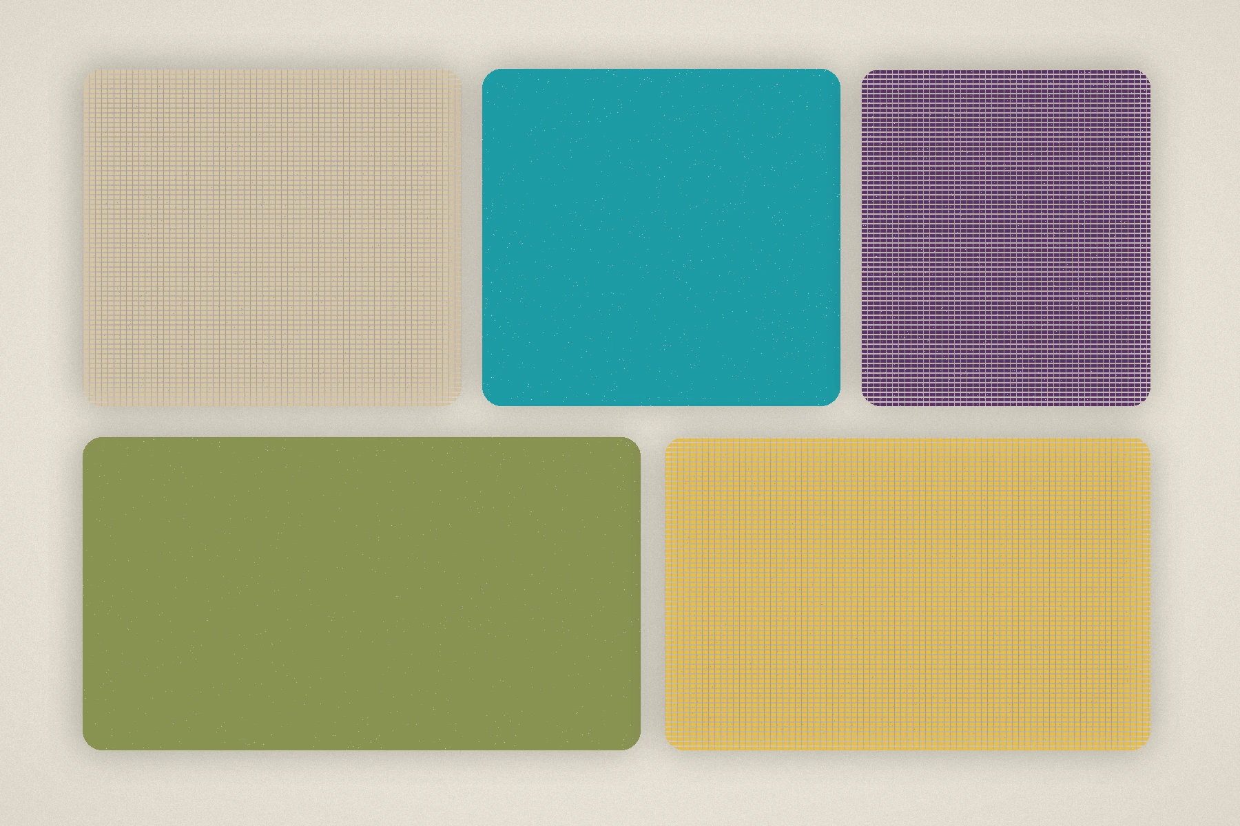
Oatmeal + turquoise + plum
Oatmeal is the field. Plum is the weight. Turquoise is the spark.
Begin with an oatmeal knit or coat, add plum trousers or a midi skirt, then introduce turquoise in one compact place: scarf, earring, bag or sock. The turquoise should be mineral rather than tropical—a little green, a little blue, not pool-water bright. Plum keeps it from floating away.
This formula likes texture. Oatmeal boucle, plum wool and turquoise enamel or satin make each shade behave differently. If the turquoise item is a knit, keep the oatmeal smooth. Two fuzzy colors beside each other can lose their edges.
For a commute, choose plum trousers, an oatmeal sweater, dark-brown shoes and a turquoise scarf that can disappear into the bag. For evening, move turquoise to a small structured bag and let plum become the knit. The neutral remains the largest piece in both versions.
Butter yellow + moss + deep brown
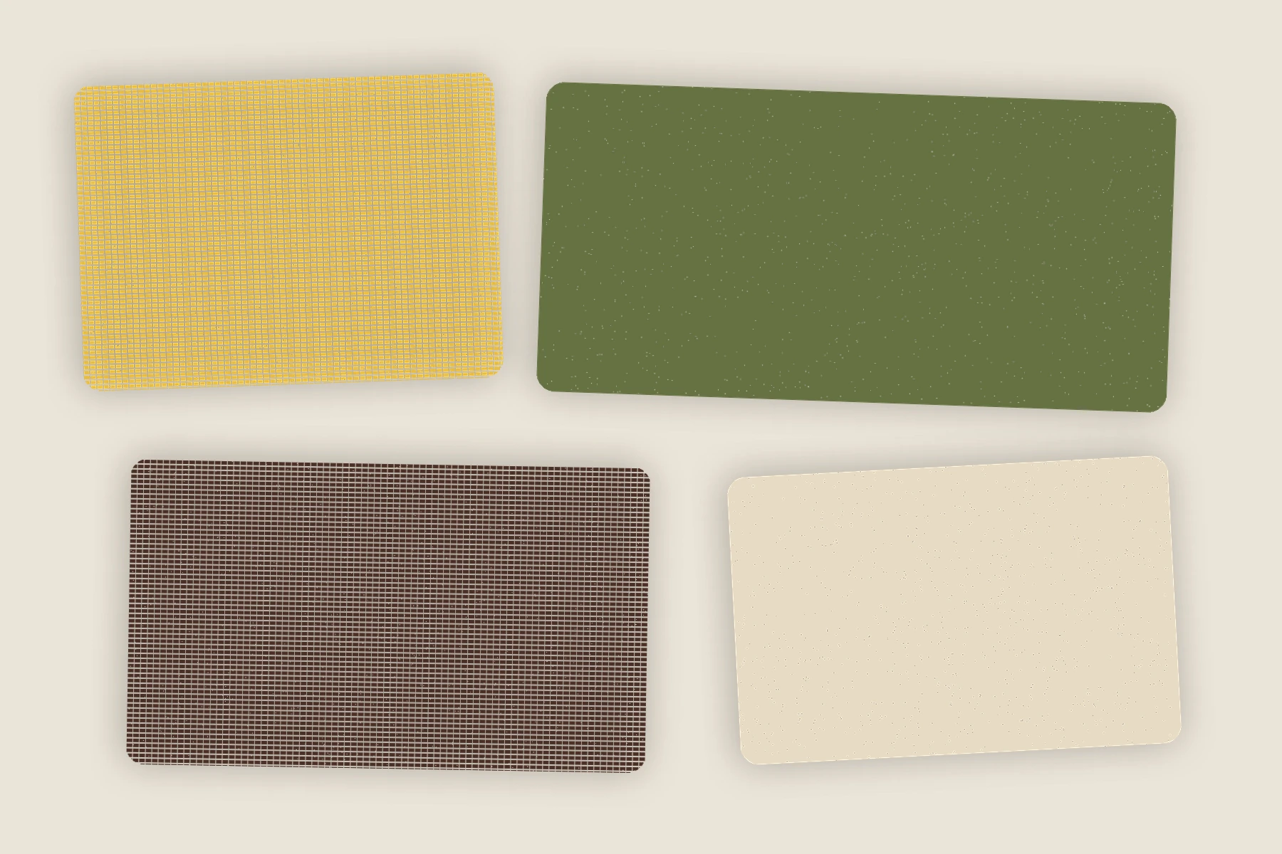
Butter yellow has been following us since spring. It does not need to leave; it needs a heavier coat. Pair a pale yellow knit with a moss jacket and deep-brown trouser or skirt. Cream footwear is lovely in theory. Tan or dark brown is better on a wet sidewalk.
The yellow should be soft, not lemon. Moss should be dusty, not army surplus. Deep brown should occupy the bottom or outermost layer so the palette has a visual floor.
This is the quietest formula in the group, which makes it good for people who want color without contrast. The shades sit close to the landscape of fall but avoid pumpkin, rust and the other usual seasonal suspects. A brass earring or buckle belongs here. Bright silver can make butter yellow look thinner.
Charcoal + royal purple + cream
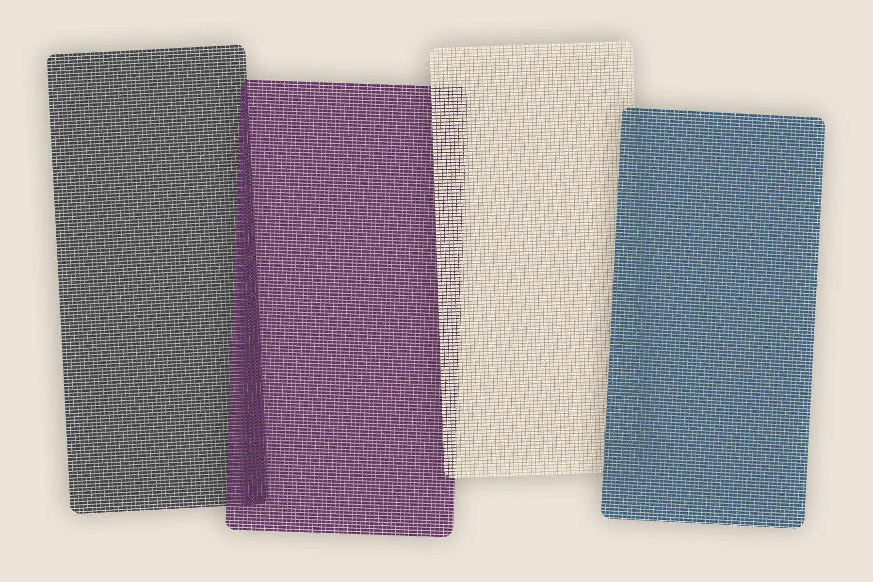
Royal purple is not subtle, and pretending otherwise makes outfits strange. Give it one uninterrupted area—a sweater, skirt or bag—then use charcoal to contain it and cream to lift it.
Royal-purple knit, charcoal trouser, cream shirt collar. Or cream sweater, charcoal coat, purple bag. The first version is direct; the second is quieter. Avoid several small purple accessories scattered across the outfit. Purple confetti is not a strategy.
The shoe can be black because charcoal makes the transition gentle. Oxblood is better if the purple leans warm. Jewelry can be silver, particularly against charcoal, but one large form works better than several delicate pieces that disappear beside the color.
Peach + tobacco + burgundy
This is the warmest formula and the easiest to get wrong. Peach needs to be the smallest light area, tobacco the broad middle and burgundy the dark stop. If peach and tobacco occupy equal space, the outfit may look faded. If burgundy dominates, peach begins to look like decoration.
Try a peach shirt, tobacco trousers and burgundy jacket. Keep the shoe dark brown and the bag simple. A cream scarf can be added when needed, but no bright white. The palette works because every color contains warmth at a different depth.
This is also the formula most likely to survive from early September through November. Peach shrinks as the temperature drops; burgundy grows; tobacco remains the bridge.
Electric blue + chocolate + one line of scarlet
The electric blue and chocolate pairing can handle scarlet, but only as a narrow line. Blue sweater, brown corduroy, scarlet sock. Chocolate coat, cream shirt, cobalt bag, red glove. The red should be discovered, not announced.
This combination is strongest when the blue is clean and the brown is tactile. A glossy blue plus glossy brown plus glossy red becomes a display window. Let one material reflect light and ask the other two to behave.
For an ordinary walking day, we would choose the blue knit, chocolate trousers, brown sneakers and scarlet socks. For dinner, blue bag, chocolate coat, scarlet fine-knit top and charcoal trousers. Same ingredients, completely different volume.
How to test a palette without buying it
Pull clothing onto the bed in daylight. Build the largest color first, then the second, then the accent. Photograph the arrangement. The camera is ruthless about colors that are too similar or too evenly distributed. Remove one item before adding another.
Next, try the outfit with the coat you already own. Many color ideas fail because the outerwear was treated as an afterthought. If the coat changes the palette completely, decide whether the idea can shrink to accessories rather than buying a new outer layer.
Then walk around the apartment in the shoes. Sit down. Put on the bag. Reach for something overhead. Color does not compensate for a strap that slides, a waistband that argues or a shoe that becomes a negotiation after twelve minutes.
Finally, save the formula as a note rather than a shopping list: "oatmeal / plum / turquoise" is enough. The next time a turquoise scarf or plum trouser appears in your actual life, you will know what role it can play. Until then, the idea can remain free.
A palette is permission, not homework
Fall trend coverage often turns color into obligation. We prefer to treat it as evidence that more combinations are possible. Fashion Week's most interesting changes may happen on a runway, but personal style becomes real in repetition, alteration and the small compromises of a city day.
Choose one formula. Change its ratios. Replace a color with the nearest thing already in the closet. Wear it long enough to discover whether it belongs to you. Borough Signal's fall palette is not a set of rules. It is a better collection of questions to ask before reaching automatically for black.
City Signal
Something especially memorable or important to the city.
PRIMARY SOURCEWho What Wear Fall 2026 fashion trend report ↗
See something that needs attention? Send a correction. We review factual notes and attach meaningful updates to the article.